Hello Everyone Hope you’re all keeping safe. For information on how to keep yourself safe from COVID-19 visit https://www.who.int/emergencies/diseases/novel-coronavirus-2019/advice-for-public This episode of Power Virtual Agents (PVA) is about understanding 'Topics' in PVA. This is for us #nocodemonkeys to leverage the power platform. Following is covered in the video: What are topics?How do you want the conversation... Continue Reading →
Agent, Power Virtual Agent- Episode 1: Getting Started
Hello Everyone Hope you're all keeping safe. For information on how to keep yourself safe from COVID-19 visit https://www.who.int/emergencies/diseases/novel-coronavirus-2019/advice-for-public This episode of Power Virtual Agents (PVA) is about how to get started? https://youtu.be/JrX2K4_81RE This is going to be a short episode as Microsoft makes it easier to build chatbots for people who don't know programming... Continue Reading →
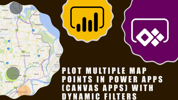
Plot Multiple Map Points In Power Apps (Canvas Apps) with Dynamic Filters
Hi Everyone In this vlog we will see how to see multiple points/pushpins on a map in canvas app. As always, this is a no code solution and fairly basic. I have came across this requirement so many times in Dynamics 365 for e.g. show all customers on a map or contacts on a map... Continue Reading →
Sharing my MVP Award with you!
Hi Everyone A huge thank you to all for supporting me by watching my videos, subscribing to my channel and blog. it couldn't have been possible without your support and that's why I decided to share my MVP award with you by unboxing it together. I received the notification of my award via email on... Continue Reading →
The Top 10 Power Automate Community Blogs of 2019
Hi Readers This list might help you to refer to these blogs when you need it. If you haven't read it yet, click on the link and read it. I have also provided the URL of Author's website (just in case you want to check out their awesome work). Please note that my list doesn't... Continue Reading →
The Top 3 DIY D365 Blogs in 2019
Hello Readers First of all a big thank you for your support in 2019. Please continue supporting. Following is a list of top 3 blog posts which you liked the most: Rank Blog PostViews1Every PowerApps Formula You Ever Wanted To Know As A Functional Consultant 31362Every Power Automate (MS Flow) Filter Query You Ever Wanted To... Continue Reading →
#TGIF Episode 8: Top Reasons to Use Power Automate (Power Automate vs Dynamics 365 Workflows)
Hi Readers and Viewers Merry Christmas and a very Happy New Year! Thanks for your support in 2019 🙂 In this video, we will look at the top reasons for you to start using Power Automate. Also, this is the last episode of the series so I thought what's better than a comparison. If you... Continue Reading →
#TGIF Episode 7: Using Power Automate (Microsoft Flow) Mobile App To Build A Flow
Hi Readers and Viewers In this blog & video, we will look at the ease of using 'Power Automate' Mobile App. First half of the blog talks about the app structure and components/features available (Almost everything is available) Second half of the blog includes a video where I am demonstrating the app and also create... Continue Reading →
#TGIF Episode 4: Understanding ‘Scope’ in Flows (Power Automate)
Hello Readers and Viewers In this episode we will try to understand 'Scope' in flows. This is a comparatively short episode as I have used visuals to explain scope. Scope is available in following categories: User Business Unit Parent Child Business Unit Organisation Custom (Yes, you can enter a custom value) Dynamics 365 people, does... Continue Reading →
Using Timer Control In PowerApps (with problem scenarios and Business use cases)
Hello Readers and Viewers This blog/video is part of my quick tip series. We are going to look at how we can force a screen to be visible to a user irrespective of the transition, in other words delay screen transition. Skip to the video, if you don't want to read Example Problem 1: if... Continue Reading →

